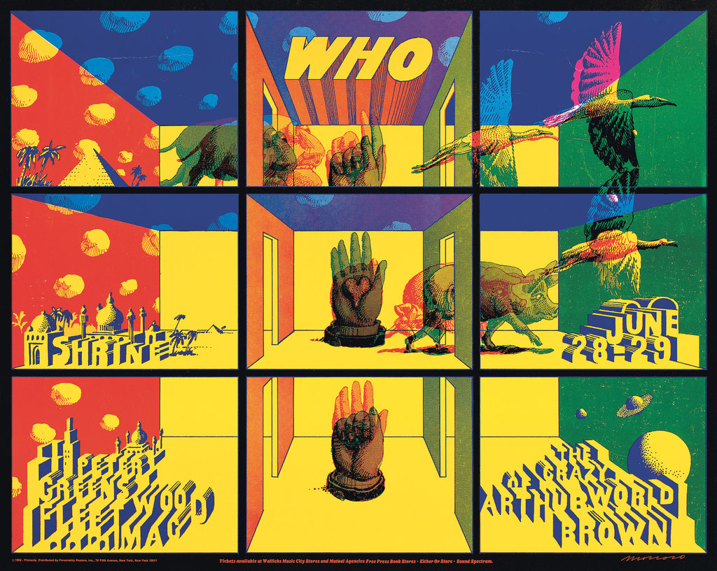
Louise Sandhaus’s new book, “Earthquakes, Mudslides, Fires & Riots: California & Graphic Design 1936-1986” ($55, Metropolis Books), is a collection of visual artifacts as eclectic as California itself. The volume begins in the year that the L.A. transplant Merle Armitage designed the nontraditionally laid-out book “Igor Stravinsky” and ends with April Greiman’s “Does it Make Sense,” a life-size digital nude self-portrait that heralded the arrival of Macintosh computer design. The 50 years and 400 pages in between are divided into four sections: “Sunbaked Modernism,” “Industry & the Indies” (work created for screens), “Sixties alt Sixties” (design beyond psychedelic posters) and “California Girls,” a survey of the many West Coast women who made waves in a male-dominated field.
In her introduction, Sandhaus, the former director of the graphic design program at the California Institute of the Arts, compares the book to a dessert sampler: Each work, she writes, was chosen “based on little more than the way the heart quickens when the eye encounters something radiant, wonderful and new.” Taken as a whole, though, the survey feels comprehensive. Alvin Lustig’s New Directions paperback covers from the ’40s and ’50s are here, as is Arts & Architecture magazine; Saul Bass’s title sequence for Otto Preminger’s “The Man With the Golden Arm”; Charles Kratka’s 1961 mosaic tile mural at LAX; John Van Hamersveld’s Day-Glo silk-screened “Endless Summer” poster; Emory Douglas’s Black Panther posters; Deborah Sussman’s prismatic graphics; and the cosmic minimalism of Stuart Brand’s Whole Earth Catalog. Icons like Charles and Ray Eames and Corita Kent are well represented, and their archives have been mined for pieces that span their professional and personal lives — like the sweetly hand-drawn and collaged love letters from Ray to Charles, or the starkly political late ’60s antiwar work from the former Sister Corita, who had renounced her vows to the Catholic Church over a conflict in beliefs.
If there’s a single principle that connects these designers, it’s their fearless use of color and an ostensible belief that more is always more. On the book’s very first page is a dinner party invitation from 1908 that a San Francisco printer made using the “rainbow roll” printing technique, later identified with psychedelic rock and L.A.’s Colby Posters. It’s as if Sandhaus is pointing out that the hippies were just continuing a tradition of high weirdness that had nothing to do with LSD — well, except for the Robert Abel and Richard Taylor “Bubbles” commercial for 7Up, a fizzy fantasia of chorus girls, neon butterflies and rainbows that Taylor, a psychedelic light show pioneer, freely admits was influenced by more than soda pop.


