“To be fully alive is to work for the common good.” —Corita Kent
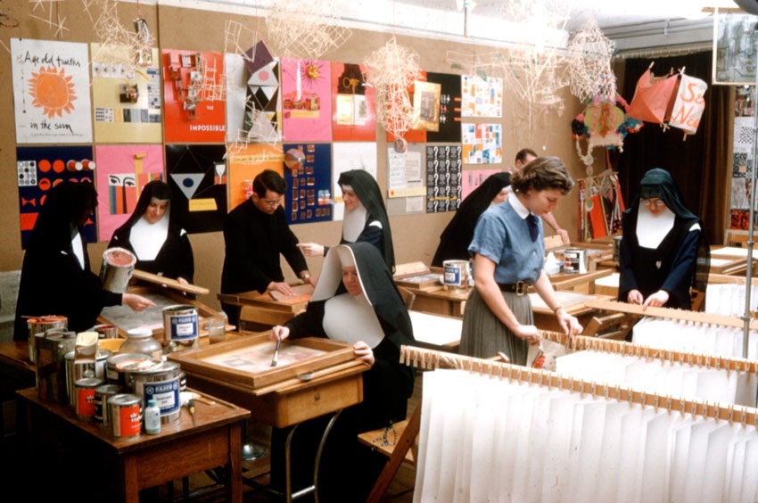
The artist best known as Sister Corita was born Frances Elizabeth Kent in 1918. She grew up in Hollywood but she was no beach bunny or glamour girl; at 18, right after graduating from high school (and to the surprise of her close friends), Frances joined the Order of the Immaculate Heart of Mary in Los Feliz, taking the vows of a nun and the name Mary Corita. Sister Corita began teaching art at Immaculate Heart College in 1946, and after receiving a master’s degree in printmaking from USC, she became head of the art department. Her early prints were mostly religious in nature, influenced by the rough lines of abstract expressionism and the more muted, earthy color palettes of the 1950s.
Serigraphy, Corita’s main medium, was an early type of silkscreen printing. At the time, it was mostly utilized for commercial sign printing, not art. Because of this, and because her work emerged from a religious context, it has tended to get overlooked in the scheme of art history. However, artists and thinkers from Ed Ruscha and Mike Kelley to Charles Eames and Buckminster Fuller have cited Corita Kent as an important influence. The latter two were Corita’s friends, and she brought them to Immaculate Heart to impart their wisdom to the students.
Corita readily acknowledged that she would not have taken up art seriously if she hadn’t become a nun, but it was Andy Warhol’s Ferus Gallery show of 1962—which famously exhibited the entire set of Campbell’s soup cans—that she said taught her to see. Suddenly, her prints became graphic and text-driven, and more often than not, primary colored. She hit her stride as a Pop artist, photographing street signs and visiting supermarkets for inspiration. She had her own “Factory,” too: a print studio across the street from the convent, where she and her students worked around the clock. Every year, she would create 30 or 35 different prints, in editions of 100 each—producing around 800 limited editions in all.
Warhol (also a devout Catholic) once said that Pop Art was simply “liking things,” and here the two artists’ philosophies completely aligned. But where Warhol celebrated the bold yet banal impact of a Brillo box, Corita recognized genuine Wonder in the colorful branding of those ubiquitous loaves of white bread (some say she saw the eucharist in the red, yellow and blue dots), and proclaimed that the General Mills “G” was for “good.” Always working to unite the secular and the sacred, she was inspired by everyone from Federico Fellini to James Baldwin to John Cage (who also came in and spoke to her students), and she often quoted the Beatles. Corita heard common themes in Beatles songs and Biblical scriptures, and she wasn’t afraid to mix up the two in her art.
Some of the most iconic images of Sister Corita show the nun with her students and fellow sisters marching with colorful banners and painted signs, many wearing flower crowns or strumming guitars, in what appears to be a protest but is in fact a celebration of Mary’s Day. It was 1964, and Corita had turned this staid saint’s day into a bonafide happening, creating a template for the Be-Ins of the Flower Children.
Optics aside, it’s not entirely accurate to call Corita Kent an activist. She considered herself an advocate for social justice—she was putting her ideas, not her body, on the line. But while she didn’t participate in protests directly, she made protest art, and her work helped to define a movement. Also, she had close friendships with figures like the priest and poet Daniel Berrigan, who was on the FBI’s most wanted list.
1965’s “My People,” made in response to the Watts Riots, reflected the growing politicization of her work. The main visual is the front page of the Los Angeles Times, turned on its side, with a banner headline announcing, EIGHT MEN SLAIN; GUARD MOVES IN. Opposing this stark black-and-white statement, in a bright smear of red ink, are quotes from a priest who was active in the civil right movement—one of which refers to Christ as “the greatest rebel of his time.” It would have been a daring statement for any artist at that time, but especially for a white woman who was a nun and a teacher. For Corita, her dedication to her work and the love she had for her fellow man were perfectly aligned with her faith, but the uncensored artist within her started to come up against the constraints of the Catholic church.
Ultimately, her impassioned beliefs about civil rights, the Vietnam War, and women’s rights would lead to her break with the order. While the reform program coming out of Rome, known as Vatican II, supported efforts to bring the Catholic church into the modern age, the Archdiocese of Los Angeles was headed by a traditionalist who vehemently opposed this kind of progress. In fact he seemed to have a personal vendetta against Corita, criticizing her style of teaching and labeling her work blasphemous. It couldn’t have helped when she appeared on the cover of Newsweek in 1967—without her nun’s habit in one photograph—under a banner reading, “The Nun: Going Modern.” After taking a sabbatical in Cape Cod in the summer of 1968, she never returned.
During her transition from Sister Corita to Corita Kent, in 1969, she made the “Heroes and Sheroes” series, appropriating images from the mass media and reproducing them in eye-popping Day-Glo hues. On first glance they could be mistaken for psychedelic rock posters but a closer look shows that the figures are slain leaders like Martin Luther King and the Kennedys, and the bold type exhorts the viewer to LOVE YOUR BROTHER or GIVE A DAMN ABOUT YOUR FELLOW MAN.
This work and much of her past output was for sale at Corita Prints, a gallery in North Hollywood founded and run by her older sister Mary Catherine, where, as one flyer advertised, her prints sold for “seven dollars and up.” Such affordable prices made the groovy graphics with a message irresistible for homes and public spaces like schools, libraries and doctor’s offices. Corita’s work grew so popular that she was commissioned by the United States Postal Service to design a stamp. Released in 1985, the simple design—the word LOVE in purple, in Corita’s own hand, under a rainbow of brush strokes—sold over 700 million copies. Corita was fighting cancer at the time, and would die the following year, but she must have rested easier knowing that her art was flying wildly across the country, landing in hundreds of millions of mailboxes like tiny prayers.


